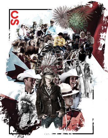
Brand Identity: Stampede Event
Although they've changed in recent years to appear sleeker and simpler, Stampede posters had previously followed what was almost like a collage style of design. They were this wonderful mish-mash of little pictures and elements portraying the unruliness of the Old West.
This project was an attempt to combine the design approach of the new and the old. It strove to bring together the cleaner and more straightforward design of recent posters with the busier and vintage look of the older ones.
→See the POSTER →See the PLANNER COVER →See the PLANNER INSIDE PAGES SPREAD →See the TICKETKeep on scrolling to read up on the creation process.
↓
Creative Choices
Although it's typically used for text and web layouts, I used the Z-pattern design to see if the overall concept is also applicable to posters. Basically, the idea is that a person starts reading from the top left before going on a zig-zag pattern and stopping at the lower right, just like how you would read a book (in the Western world anyway). You would then want to place your layout elements accordingly.
As for the artwork itself, I aimed for a 'majestic' look overall. For instance, the horse was photoshopped from its original horizontal posture into one where it's rearing up on its hind legs. I then replaced its mane with the Canadian flag billowing gloriously up high, as if the horse meant for it to do so.
♦
