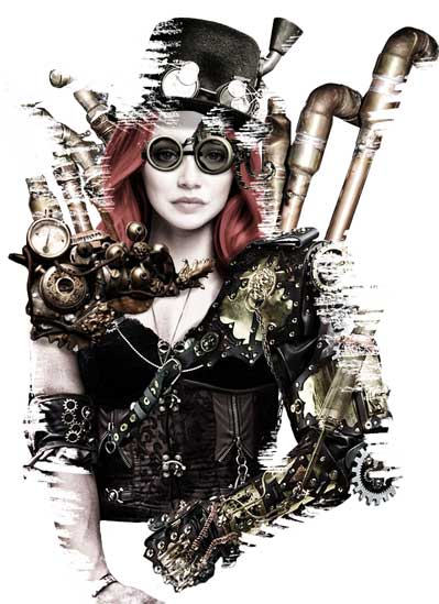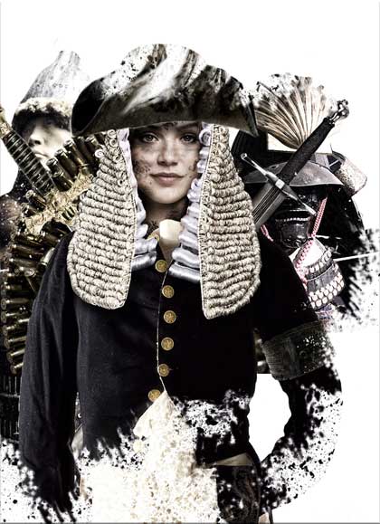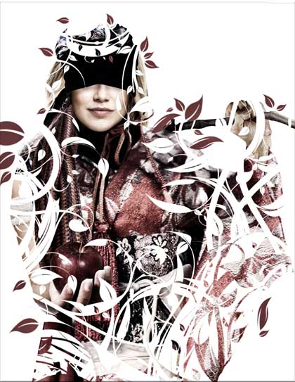
Tinker, Tailor
This project began as a study on how Photoshop is commonly used in the industry. While photographers usually use the program to do the odd color correction here and there, I was mainly interested in what the fashion industry and advertisers used the program for.
The goal was then to modify several times the same picture of a woman while making changes such as switching her clothes, her complexion, and so on, just as you would see done with clothing models on ads.
I ended up wanting to make things a little flashy halfway through the project and so I started making more outlandish modifications. I then used the popular counting game, Tinker, Tailor, as inspiration.
→CHECK THE PIECE OUT →VIEW PART OF THE PROCESS IN ACTIONOtherwise, keep on scrolling to read up on the creation process.
↓
The Limerick
Most people may recognize the name more from the movie called Tinker Tailor Soldier Spy. If you take a closer look at the 4-part artwork, you might notice that each picture follows the movie title's sequencing. On the original limerick, the line goes: Tinker, Tailor, Soldier, Sailor, Rich Main, Poor Man, Beggar Man, Thief.
For the artwork, I thought to combine the Soldier with the Sailor and the Beggar with the Thief. I then used various little symbolic pieces to try to show the stereotypical nature of the profession they were portraying. For instance, the Beggar/Thief has her hand out offering a bright red apple. That hinted to a slight mischievous intent.
↓


The Photoshop Work
There were several things that I wanted to explore. One was the Liquefy tool which is well known for modifying 'face and body parts'. I used that to make the Tinker's jawline have a more heart-shaped and pointed appearance.
The second thing revolved around the slight and not-so-slight modifications of Photoshopped clothing to make them seem more natural, as if the person was actually wearing them in the first place. This involved several hours of playing around with the Warp and Transform options just to get the 'waviness' of the loose cloth look believable.
Towards the end, I did a bit of color correction and balancing to try to match all the layers. Coupled that with a few swishes of some 'natural' brushes, and I achieved that bleached look I was going for.
→INTERACTIVE VIEW OF PART OF THE LAYERING PROCESS↓
Attribution
Wreath
by Quasic | CC BY-SA 2.0
Steampunk
by Tyrus Flynn | CC BY-SA 3.0
Steampunk
by Nathan Forget | CC BY 2.0
Steampunk
by Akshat Rathi | CC BY 2.0
Ocular
by Bernard Goldbach | CC BY 2.0
Tophat
by Veronique Mergaux | CC BY-SA 2.0
Lady
by nio_nl | CC BY-SA 2.0
Pipes
by Michael Pereckas | CC BY-SA 2.0
Blindfold
by Dale/Kim Schoonover | CC BY 3.0
Scarf
by smittenkittenorig | CC BY 2.0
Other assets from Pexels
| CC0 1.0
Other assets from Public Domain Pictures
| CC0 1.0
Other assets from Wikimedia Commons
| CC0 1.0
♦