Vignette
Vignette is an online publication for a digital magazine that is all about Photoshop. It is a combo project looking to combine extensive Photoshop work with layouts made in InDesign. Everything, from the written to content to the art pieces, were created solely by me for this project.
This project essentially had three layers to it: creating the art pieces, writing the content, and then laying it all out in an animated and interactive format.
→See the FULL INTERACTIVE MAGAZINEOtherwise, keep on scrolling to read up on the creation process.
↓
Laying Out The Pieces
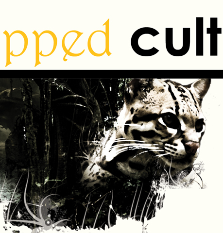
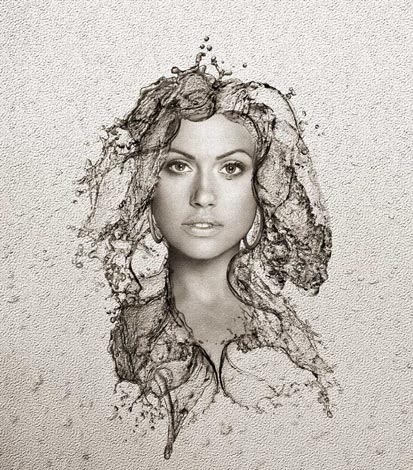
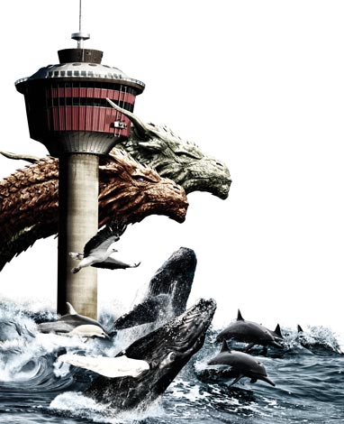
One of the great things about photoshopping images is that it's almost like drawing. You could potentially create or draw anything you want, being limited only by your imagination. With some of the pieces for this publication, I used images of nature and wild animals and photoshopped them in a seemingly haphazard kind of way. This was to contrast the uniform lines and layouts of the paragraphs and headers.
With that said, I also laid out the written content in an unconventional manner, usually with the aid of thick straight lines to distract from their overall uniformity.
↓


Animating with InDesign
The process is straightforward enough: simply select the piece you want animated, apply a pre-defined animation, set the timer, then you're done. Of course, with a multi-page piece, the job becomes just a little bit more arduous.
There is also a chance of you becoming enamored with the animations. So you then go overboard and start animating every little thing. Happened to me.
Although I still ended up animating almost everything, I tried to keep them subtle and repetitive between pages, in an attempt to not have them so obviously distracting, but almost natural to the 'flow' of the pages.
All in all, this project was a lot of fun to make. Was it a smooth process? Definitely not, and it still has plenty of flaws. However, seeing it come together piece by piece was a fantastic experience.
♦